Skip to content
JenLynnArt
Home
Artwork
Musings
About
Biography
Artist Statement
Resume
Contact
Pen & Ink
Card Art
Read More
: Card Art
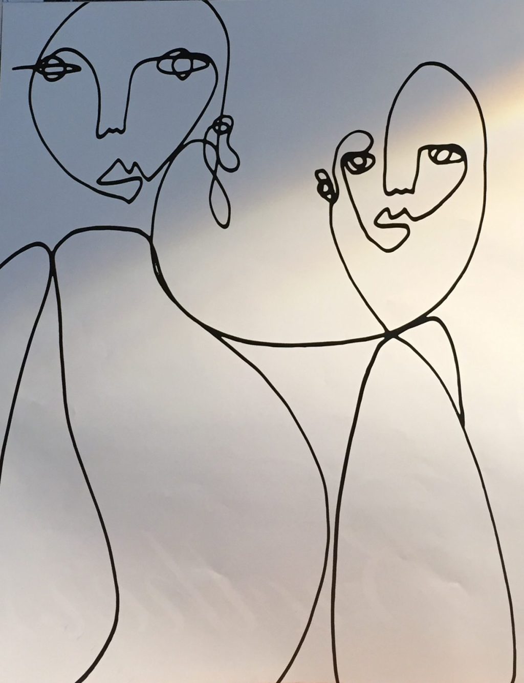
Continuous Line Drawing
Read More
: Continuous Line Drawing
Rhino
Read More
: Rhino
Zoe
Read More
: Zoe
Ethan
Read More
: Ethan
What Are You Looking At?
Read More
: What Are You Looking At?
Dylan
Read More
: Dylan
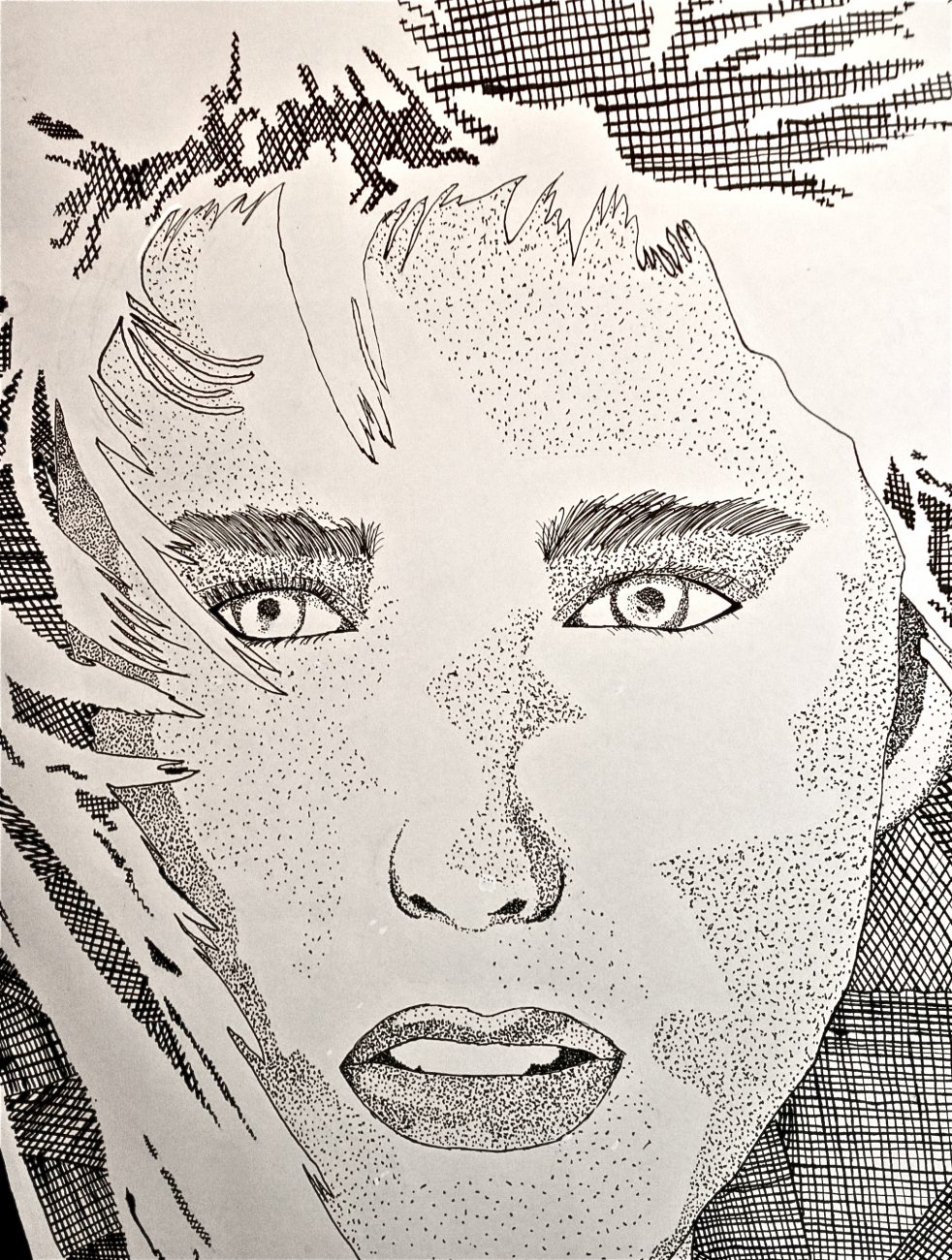
The Face
Read More
: The Face
The Jacket
Read More
: The Jacket
Privacy & Cookies: This site uses cookies. By continuing to use this website, you agree to their use.
To find out more, including how to control cookies, see here:
Cookie Policy
Subscribe
Subscribed
JenLynnArt
Join 194 other subscribers
Sign me up
Already have a WordPress.com account?
Log in now.
JenLynnArt
Subscribe
Subscribed
Sign up
Log in
Report this content
View site in Reader
Manage subscriptions
Collapse this bar