Skip to content
JenLynnArt
Home
Artwork
Musings
About
Biography
Artist Statement
Resume
Contact
Art History
Van Gogh Immersion
Read More
: Van Gogh Immersion
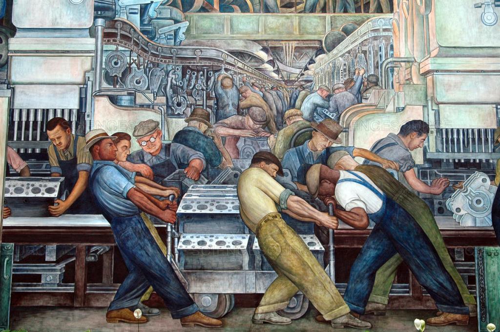
Detroit – Part II
Read More
: Detroit – Part II
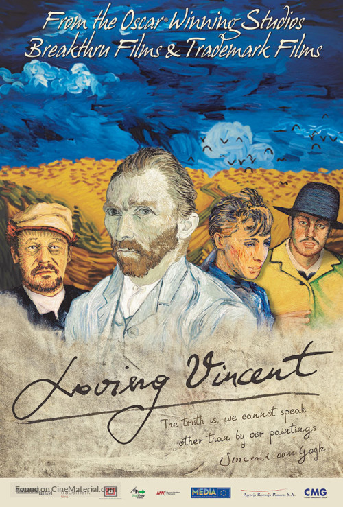
Loving Vincent
Read More
: Loving Vincent
A Brief History of Color in Art
Read More
: A Brief History of Color in Art
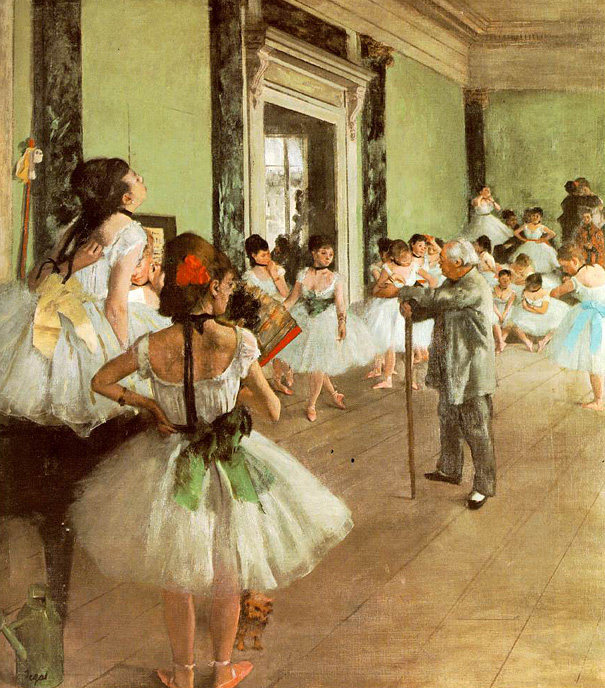
Art for Dummies
Read More
: Art for Dummies
Modern Art Simplified
Read More
: Modern Art Simplified
Diego Rivera and Frida Kahlo in Detroit
Read More
: Diego Rivera and Frida Kahlo in Detroit
La Maison Rose
Read More
: La Maison Rose
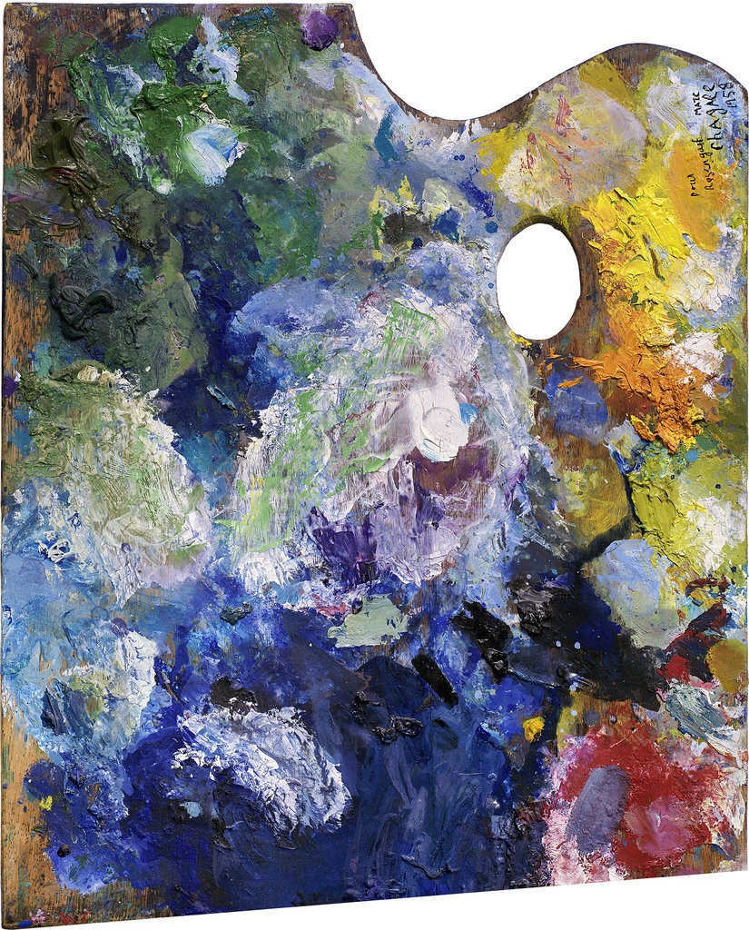
Photographic Portraits of Famous Artist’s Paint Palettes
Read More
: Photographic Portraits of Famous Artist’s Paint Palettes
Once-In-A-Lifetime Opportunity
Read More
: Once-In-A-Lifetime Opportunity
Church & Update
Read More
: Church & Update
Privacy & Cookies: This site uses cookies. By continuing to use this website, you agree to their use.
To find out more, including how to control cookies, see here:
Cookie Policy
Subscribe
Subscribed
JenLynnArt
Join 194 other subscribers
Sign me up
Already have a WordPress.com account?
Log in now.
JenLynnArt
Subscribe
Subscribed
Sign up
Log in
Report this content
View site in Reader
Manage subscriptions
Collapse this bar