Skip to content
JenLynnArt
Home
Artwork
Musings
About
Biography
Artist Statement
Resume
Contact
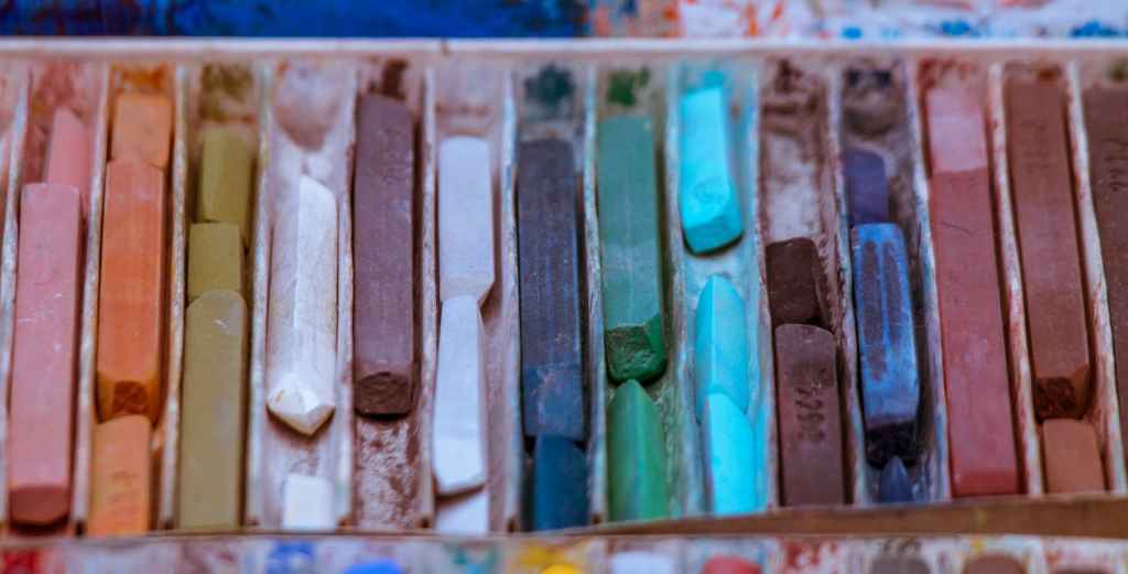
Pastel
Pastel Paintings
Read More
: Pastel Paintings
Jordan
Read More
: Jordan
Oh, Hello
Read More
: Oh, Hello
Greek Vase & Dummy
Read More
: Greek Vase & Dummy
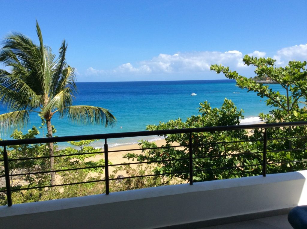
Sosua, Dominican Republic
Read More
: Sosua, Dominican Republic
Red Jacket
Read More
: Red Jacket
Fall
Read More
: Fall
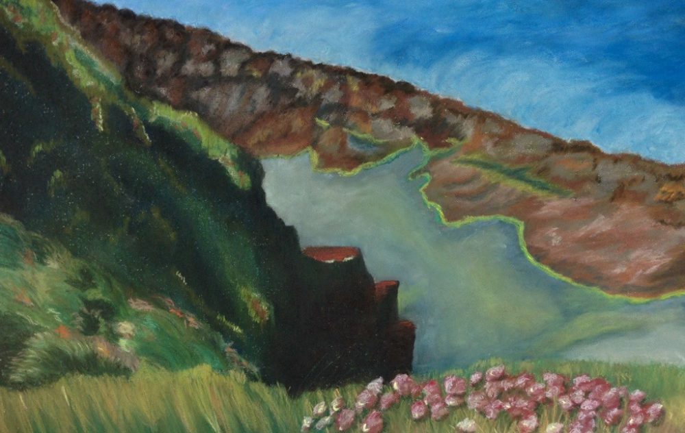
Ireland
Read More
: Ireland
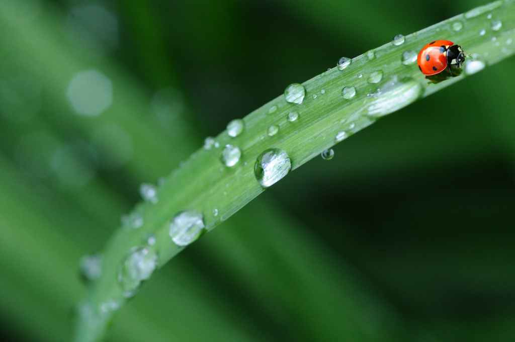
Rain
Read More
: Rain
Venice
Read More
: Venice
Yellow House
Read More
: Yellow House
Bailey Rae 2009-2013
Read More
: Bailey Rae 2009-2013
Tribute to Van Gogh
Read More
: Tribute to Van Gogh
The Beach
Read More
: The Beach
I’m Watching You
Read More
: I’m Watching You
Shut Your Mouth!
Read More
: Shut Your Mouth!
1
2
Next Page
Privacy & Cookies: This site uses cookies. By continuing to use this website, you agree to their use.
To find out more, including how to control cookies, see here:
Cookie Policy
Subscribe
Subscribed
JenLynnArt
Join 194 other subscribers
Sign me up
Already have a WordPress.com account?
Log in now.
JenLynnArt
Subscribe
Subscribed
Sign up
Log in
Report this content
View site in Reader
Manage subscriptions
Collapse this bar